

1. Overview
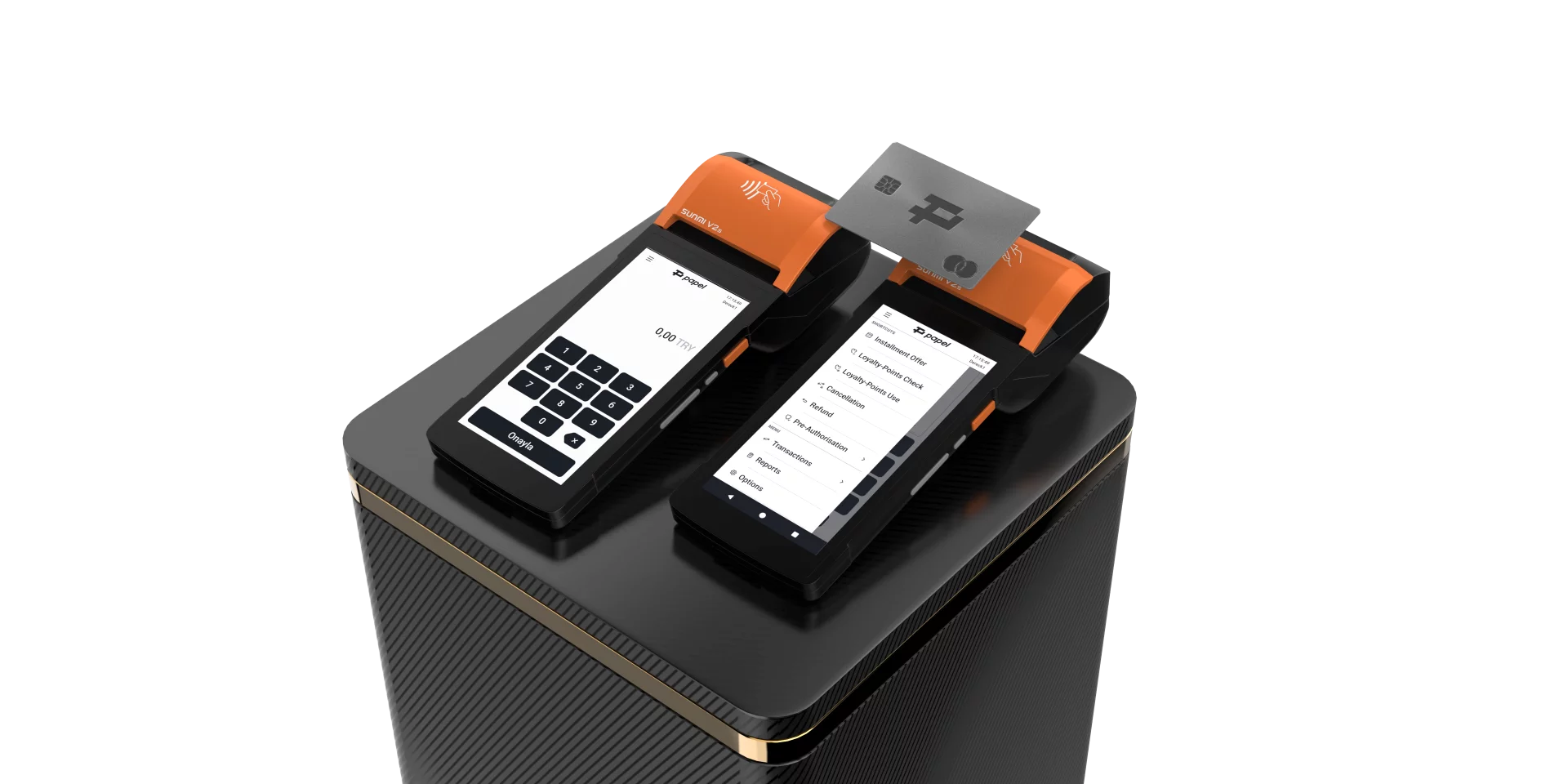
Papel.com, a leading payment solutions provider, engaged us to redesign the user interface and refine the user experience of their payment terminal application for Sunmi V2S devices. Our task was to create a modern, intuitive interface that would streamline merchant operations while maintaining the robust functionality required in fast-paced retail environments.
2. The Challenge
The existing Papel payment terminal application required a comprehensive visual and functional refresh. The interface needed to serve merchants efficiently during high-pressure transaction scenarios while accommodating complex features like loyalty programs, installment offers, and pre-authorization processes. The design had to work seamlessly on the Sunmi V2S hardware, accounting for its specific display characteristics and touchscreen interactions in various retail lighting conditions.
3. Our Solution
We delivered a complete UI redesign paired with strategic UX refinements that transformed the application into a more efficient and visually cohesive tool for both Merchants and Cardholders.
4. Interface Redesign
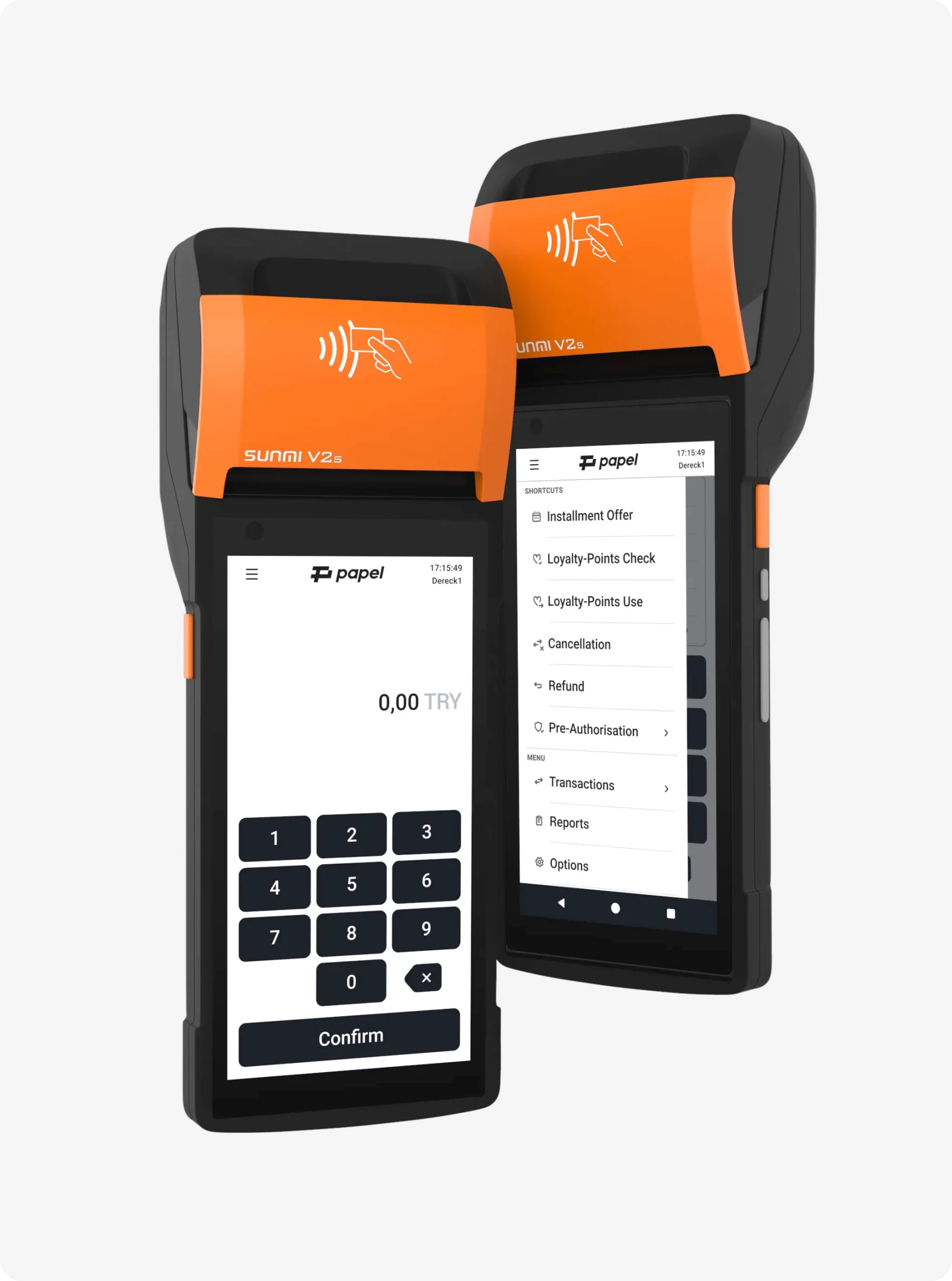
The visual overhaul focused on clarity and efficiency. We redesigned the home screen with a streamlined numeric keypad for transaction entry, featuring a clean layout that prioritizes the most frequent user actions. The menu system was restructured into a logical drawer-based navigation, organizing features into clear categories: Installment Offers, Loyalty Points, Pre-Authorization, Transactions, Reports, and Settings.
We developed a consistent design language throughout the application, with standardized button styles, card layouts, and typography optimized for the terminal's display. The color palette reinforces Papel's brand identity while ensuring excellent contrast and readability in diverse retail environments.
5. User Experience Enhancement
Beyond visual refinement, we optimized key user flows to reduce friction. The payment entry process was simplified to minimize steps between transaction initiation and completion. Menu hierarchies were reorganized based on usage patterns, placing frequently accessed features within easy reach while maintaining logical groupings for advanced functions.
The interface supports full localization, with approved designs delivered in both Turkish and English to serve Papel's market effectively.
6. Custom Iconography
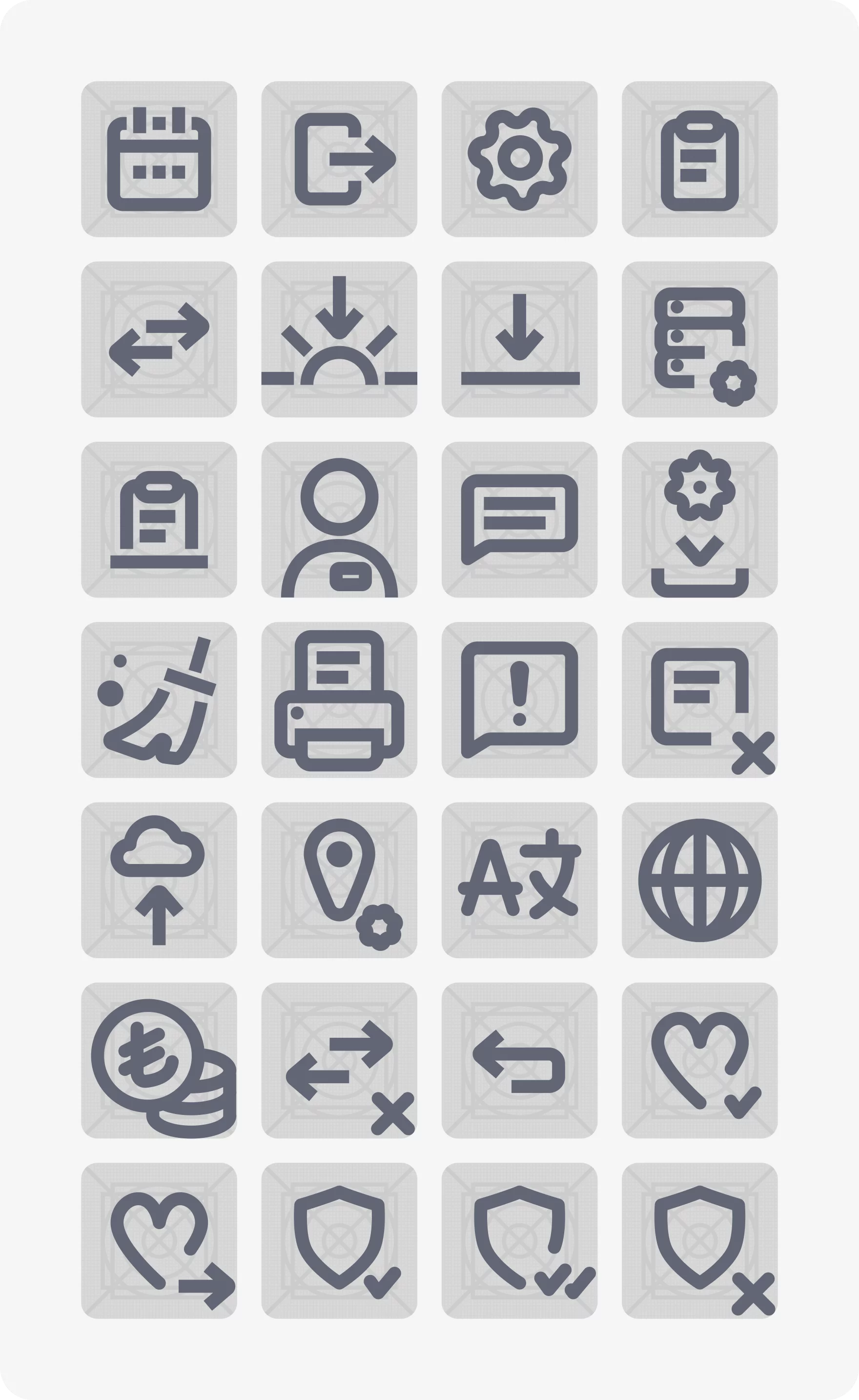
We designed a comprehensive custom icon set specifically for the Papel application. Each icon was crafted to be immediately recognizable at the terminal's native resolution, creating a cohesive visual language that complements the overall interface design. The icons maintain clarity and consistency across all menu items and actions, ensuring users can quickly identify functions even in fast-paced retail contexts.

7. UI Animation Design
To enhance usability and provide essential visual feedback, we designed custom UI animations throughout the application. These include smooth transitions between screens, feedback animations for successful transactions and confirmations, thoughtful loading states, and subtle interactive elements that improve the tactile experience on the touchscreen interface. The animations were designed to feel responsive without introducing unnecessary delays in critical transaction workflows.
8. The Result
The redesigned Papel payment terminal application successfully progressed through client approval across versions 2.25 and 2.26, with all deliverables signed off for production. The new interface provides merchants with a professional, efficient tool that reduces transaction time while maintaining the comprehensive functionality they require.
The cohesive design system, custom iconography, and thoughtful animations create a modern user experience that reflects Papel's position as a forward-thinking payment solutions provider. The interface scales effectively to support future feature additions while maintaining the clarity and efficiency that merchants depend on in their daily operations.